Saturday, February 1, 2014

Creating a "Card" UI

The newest version of most Android apps published by Google have started featuring "cards."  Many other popular apps are also following suit... After reading this tutorial you will be able to create cards as well.  It really is very simple.

What is a Card?

A card is nothing more than a layout or a view with a background drawable. And that drawable can be defined in XML as a layer drawable.

res/drawable/layer_card_background.xml
<?xml version="1.0" encoding="utf-8"?>
<layer-list xmlns:android="http://schemas.android.com/apk/res/android">
   <item>
      <shape android:shape="rectangle">
         <solid android:color="#CABBBBBB"/>
         <corners android:radius="2dp" />
      </shape>
   </item>

   <item
      android:left="0dp"
      android:right="0dp"
      android:top="0dp"
      android:bottom="2dp">
      <shape android:shape="rectangle">
         <solid android:color="@android:color/white"/>
         <corners android:radius="2dp" />
      </shape>
   </item>
</layer-list>

The first item in the layer-list defines what will be the card's shadow.  The second item in the layer-list is the main content for the card.  You can turn any view or layout into a card by setting the background to the layer_card_background drawable.

res/layout/hello_card.xml
<?xml version="1.0" encoding="utf-8"?>
<LinearLayout 
   xmlns:android="http://schemas.android.com/apk/res/android"
   android:layout_width="match_parent"
   android:layout_height="match_parent"
   android:gravity="center"
   android:background="#E0EEEE">
   <TextView
      android:layout_width="wrap_content"
      android:layout_height="wrap_content"
      android:layout_gravity="center"
      android:gravity="center"
      android:layout_margin="15dp"
      android:padding="15dp"
      android:background="@drawable/layer_card_background"
      android:text="Hello Card!\nThis is an example of a card..."/>
</LinearLayout>


Putting Cards in a List

At this point you probably realize that putting cards in a list view isn't all that difficult.  However, there are a few details that you won't want to overlook...

ListView Setup

In your listview's XML definition, you need the following attributes set:
  • android:divider="@null"
  • android:dividerHeight="10dp"
  • android:listSelector="@android:color/transparent" 
  • android:cacheColorHint="@android:color/transparent"
  • android:headerDividersEnabled="true"
  • android:footerDividersEnabled="true"

The first attribute tells the listview that you don't want a view used for the listview's divider.  The second attribute tells the listview the height of the divider.  Since we have specified @null for the divider this will be the space between each card in the list. Setting the list selector color to transparent allows us to define our own pressed state behavior for the card.  Setting the cache color hint to transparent is a good thing to do if you run into weird behaviors while scrolling.   The last two attributes will allow for margin values at the top and bottom of the list, but it will require a few changes to the listview in code as well.  After inflating the list view, and before calling setAdapter(), add empty header and footer views, like this:

m_list.addHeaderView(new View(this));
m_list.addFooterView(new View(this));

Card Item Selector Setup

If you don't want to have a pressed state for the cards in the list then you can skip this step.  Otherwise, create a new drawable file called layer_card_background_pressed.xml.  It should be a duplicate of layer_card_background.xml but the main color defined in the second item should be changed to a different color for the pressed state.

res/drawable/layer_card_background_selected.xml
<?xml version="1.0" encoding="utf-8"?>
<layer-list xmlns:android="http://schemas.android.com/apk/res/android">
   <item>
      <shape android:shape="rectangle">
         <solid android:color="#CABBBBBB"/>
         <corners android:radius="2dp" />
      </shape>
   </item>

   <item
      android:left="0dp"
      android:right="0dp"
      android:top="0dp"
      android:bottom="2dp">
      <shape android:shape="rectangle">
         <solid android:color="#CCCCCC"/>
         <corners android:radius="2dp" />
      </shape>
   </item>
</layer-list>

Next you need to create a selector resource that will be used as the background for the card items.

res/drawable/selector_card_background.xml
<?xml version="1.0" encoding="utf-8"?>

<selector xmlns:android="http://schemas.android.com/apk/res/android">
   <item
      android:state_pressed="true"
      android:drawable="@drawable/layer_card_background_selected" />

   <item android:drawable="@drawable/layer_card_background" />
</selector>

Card Item Layout Setup

ListView items will take up the entire width of the ListView.  In general this isn't a problem but when creating a list of cards this just won't work. To get around this, you need to wrap the item with the card background in another layout that has padding values set.  Here is an example card item layout that does this:

res/layout/list_item_card.xml
<?xml version="1.0" encoding="utf-8"?>
<FrameLayout
   xmlns:android="http://schemas.android.com/apk/res/android"
   android:layout_width="match_parent"
   android:layout_height="wrap_content"
   android:paddingLeft="15dp"
   android:paddingRight="15dp"
   android:descendantFocusability="beforeDescendants">

   <LinearLayout
      android:orientation="vertical"
      android:layout_width="match_parent"
      android:layout_height="wrap_content"
      android:paddingLeft="15dp"
      android:paddingTop="15dp"
      android:paddingBottom="15dp"
      android:paddingRight="15dp"
      android:background="@drawable/selector_card_background"
      android:descendantFocusability="afterDescendants">

      <TextView
         android:id="@+id/text1"
         android:layout_width="wrap_content"
         android:layout_height="wrap_content"/>

      <TextView
         android:id="@+id/text2"
         android:layout_width="wrap_content"
         android:layout_height="wrap_content"/>

      <TextView
         android:id="@+id/text3"
         android:layout_width="wrap_content"
         android:layout_height="wrap_content"/>
   </LinearLayout>
</FrameLayout>

Inflating the Items

Now all you have to do is get your adapter to inflate the items with the above layout. You can modify anything inside the LinearLayout... You can even change the LinearLayout to a different kind of layout if you need to.  Just don't change any of the attributes on the FrameLayout other than the padding or item clicks may not work right.

For information on a really cool way to prevent writing lots of adapters check our my last post.


If you want the entire source used for this post you can download this IntelliJ Project.

Tuesday, December 10, 2013

ViewInflater: Managing Adapter Overgrowth

Unexcused Absence

I can't believe it has been over a year since my last post.  I started with good intentions, but ran out of time... juggling a full-time job, school work (I have finally graduated... with a B.S. in Computer Science from Utah Valley University), and various Android contract work on the side.

My goal from here on out is to publish at least one post per month (and hopefully two) with various tips and tricks I've learned and/or come across while developing for the Android platform.  I believe I'm at a point now that I can do that.

Now... on to the topic at hand!

Background

I started Android development before the T-Mobile G1 was available here in Utah.  It was announced. I had it preordered.  And I started looking into developing... A hobby and career was born.

While developing my apps I used lists... there were lots of lists.  And any good Android developer knows that when you have a list you need an adapter to manage the items in that list.  There are a number of adapter classes that can be used, and they all have different advantages and disadvantages.

Before I knew it, I had a project that had around 10 adapter subclasses... And all of them had pretty much the same code.  Upon closer inspection, I realized that most of them were virtually identical except for two main differences:
  1. The type of data backing the adapter
  2. The view that was inflated for each item
 After seeing this same pattern in many other projects, an idea began to form in my head... And the ViewInflater pattern was born.

ViewInflater: The Pattern

I wanted a single adapter class that would be able to deal with the two differences outlined above.  Java Generics was the obvious answer to dealing with the many different types of data.  Android already had an ArrayAdapter<T> class, but after looking at it, I realized it wasn't suited for dealing with the many different views that an adapter could inflate.

I wrote my own adapter class that uses Generics, and in that regards is very similar to Android's ArrayAdapter<T> class.  To deal with the different views that an adapter could inflate, I decided to promote the getView() method to an object.  In order to do that, I did the following:
  • Defined a ViewInflater<T> interface in my Adapter with an inflate() method
  • Had the Adapter hold a reference to the ViewInflater object
  • Had the Adapter's getView() method call ViewInflater.inflate() to generate the view
The entire class (minus boring boilerplate stuff like getCount(), add(), etc...) looks like this:
 
public class ViewInflaterAdapter<T> extends BaseAdapter
{
    private ArrayList<T> m_data;
    private ViewInflater m_inflater;

    public ViewInflaterAdapter (ViewInflater inflater)
    {
        m_inflater = inflater;
        m_data = new ArrayList<T>();
    }

    public ViewInflaterAdapter (ViewInflater inflater, List<T> data)
    {
        m_inflater = inflater;
        m_data = new ArrayList<T>(data);
    }

    /////////////////////////////////////////////////////
    //Typicial adapter code goes here
    /////////////////////////////////////////////////////

    public void setInflater(ViewInflater inflater)
    {
        m_inflater = inflater;
    }

    public T getTItem(int pos)
    {
        return m_data.get(pos);
    }

    @Override
    public View getView(int pos, View convertView, ViewGroup parent)
    {
        return m_inflater != null ? m_inflater.inflate(this, pos, convertView, parent) : null;
    }

    public interface ViewInflater<T>
    {
        View inflate (ViewInflaterAdapter<T> adapter, int pos, View ConvertView, ViewGroup parent);
    }
}

The above adapter now acts as a general purpose class... And unless you need something special from some of the other adapter classes you never have to write another Adapter again (but if you do need to write one based on one of the other adapter flavors, you can still use this pattern for it).  Just create a new class that implements ViewInflater and all the code that would normally go in getView() goes in your inflater's inflate() method.

A simplified version of an inflater would look something like this:
public class MyItemInflater implements ViewInflaterAdapter<String>
{
     @Override
     public View inflate(ViewInflaterAdapter<String> adapter, int pos, View convertView, ViewGroup parent)
     {
          LayoutInflater inflater = LayoutInflater.from(parent.getContext());
          View itemView = inflater.inflate(R.layout.my_item_inflater, parent, false);
          TextView textView = (TextView)itemView.findViewById(R.id.my_item_text);
          textView.setText(adapter.getTItem(pos));
          return itemView;
     }
}

To keep the example simple I assumed that R.layout.my_item_inflater exists and that it contains a TextView with an id set to R.id.my_item_text. I also did not incorporate the ViewHolder pattern, which is a very good design pattern when dealing with adapters and lists, and is very easy to add when using the ViewInflater pattern. If you have a more complicated layout you can add a constructor and pass in click listeners for buttons or checkboxes.

Since you are dealing with a class instead of just a method, you have a lot more flexibility and freedom to make the code work the way you want it to. The ViewInflater pattern separates UI code from non-UI code because the adapter is no longer directly in charge of creating views. It also promotes code reuse by keeping down the number of adapter classes and promotes flexibility by "promoting" the getView() method to a class.

I haven't tried this yet, but I would imagine you would be able to dynamically change the view that gets inflated.  You might have to do some special-case handling with the getItemViewType() method though.

Here is an example of how it might be used with a ListView:
ArrayList<String> data = new ArrayList<String>();
//Add items to data...
MyItemInflater inflater = new MyItemInflater();
ViewInflaterAdapter<String> adapter = new ViewInflaterAdapter(inflater, data);

//Assume that rootView is already defined and that it contains a ListView whose id is my_id 
ListView list = (ListView) rootView.findViewById(R.id.my_list);
list.setAdapter(adapter);
Happy coding... Hope you found this post useful!

Thursday, September 20, 2012

XML Drawables (Part II)

In the first part of this post, I covered rectangle and oval shapes.  In this post I will cover the remaining shape types (line and ring) that can be defined in XML.

Line
When used well, this shape type can add a pleasing visual experience to your Android application.  It is most often used a visual separator between different sections or parts of the app and can make it easier to use.

One important thing to note is that this line ALWAYS takes up the entire width of the containing view.  This may seem like quite a hindrance at first but I've found that in most cases you can get the look and feel you want...  We'll see this in the examples below. 

First, let's look at the simplest example of a line, a simple solid-black line...

res/drawable/shape_black_line.xml
<?xml version="1.0" encoding="utf-8"?>
<shape
    xmlns:android="http://schemas.android.com/apk/res/android"
    android:shape="line">
    
    <stroke 
        android:width="2dp" 
        android:color="#000000" />
    
    <size android:height="20dp" />
    
</shape>

Some important things to keep in mind when creating a line:
  • The width attribute on the stroke element defines the height of the line
  • The height attribute on the size element defines the height of the entire drawable
  • When the line is drawn it is centered vertically in the drawable
  • If the height is the same or smaller than the stroke width then the line won't show up.
  • You can omit the height attribute, but if you do you need to take care to make sure that every view that uses this line specifies a height larger than the stroke width


 It is also possible to create a dashed line.  To do so, we specify the dashWidth and dashGap attributes on the stroke element. 

res/drawable/shape_dotted_green_line.xml
<?xml version="1.0" encoding="utf-8"?>
<shape
    xmlns:android="http://schemas.android.com/apk/res/android"
    android:shape="line">
    
    <stroke 
        android:width="2dp" 
        android:color="#008000" 
        android:dashWidth="3dp"
        android:dashGap="4dp"/>
    
    <size android:height="20dp" />
    
</shape>


Controlling Line Length

Depending on what you are trying to accomplish, there are a number of ways to control the actual width of the line.  We will look at three different methods for doing this.  The method you choose will depend greatly on the app you are developing.

1) Specify Length in the Drawable
With this method, your line will always have an exact width.  To do this, you need to add the android:width attribute to the size element in your XML file.  This isn't the only thing that needs to be done, however.  If you use an ImageView to display your line, you need to be sure to specify the drawable using the android:src attribute... If you use ImageView's android:background attribute you will end up with a line that fills the entire width of your screen.

The following screenshots show an example of a line with a length 150dp:

2) Specify Margins in the View
Rather than having a fixed length, this method allows you to have a fixed margin on each side of the drawable. To specify the length of the line this way you add the android:layout_marginLeft and android:layout_marginRight attributes on the view that will contain your drawable.  One advantage to using this method is that you can specify the drawable with either the android:src or android:background attributes (if you are using an ImageView... other views may be slightly different).

The screenshots below show an example of an ImageView with left and right margin values of 50dp:
3) Specify Width in the View
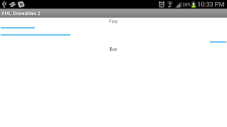
 Like the first method, this will result in a line that is the same width regardless of the orientation of the screen.  But like the second method you change an attribute on the view that contains the drawable.  Since the width is defined in the view, you can reuse the drawable in different views and create lines of different lengths.  To do this, you specify the width of the view with the android:width attribute.

The screenshots below show ImageViews with lengths of 100dp, 200dp, and 50dp.  The last line is right-aligned:
Ring
I'm going to be really honest about this shape... I can't think of many uses for it.  The main one that comes to mind would be to define an indeterminate progress wheel.  Other than that its usefulness is pretty limited.  The easiest way to define a ring is to define its inner radius (the radius of the hole) and its thickness.  You can also define a stroke, a solid background color, or a gradient background as demonstrated in the first part of this blog.  Here is a basic definition for a ring:

res/drawable/shape_ring.xml
<?xml version="1.0" encoding="utf-8"?>
<shape
    xmlns:android="http://schemas.android.com/apk/res/android"
    android:shape="ring"
    android:innerRadius="15dp"
    android:thickness="10dp"
    android:useLevel="false">
    
    <solid android:color="#ababf2" />
    
    <size
        android:height="50dp"
        android:width="50dp" />
</shape>

A couple additional things to note about ring drawables.  You need to make sure that you set the useLevel attribute to false.  I don't understand why this is the case, but the docs state that if this is not set to false the shape may not display... in all of my tests the ring did not get displayed unless this attribute was set to false.

Also note that there are two additional attributes that you can use to specify the inner radius and thickness.  These are android:innerRadiusRatio and android:thicknessRatio.  These attributes allow you to specify the settings based on the width of the drawable.  For example, if you used android:innerRadiusRatio="3" and the width of the ring was specified as 60dp then the inner radius would be 20dp.

The screenshots below show different examples of using a ring.  The first one is the ring specified above.  The others show what a ring would look like with a stroke and a gradient.  The source files can be downloaded as part of the sample project at the end of this blog:

Hopefully you now have a solid understanding of how to properly specify lines and rings in XML.  You can download all the source files from this post below.  As always, comments, questions, or suggestions are always welcome.

Download Sample Project

Sunday, August 12, 2012

XML Drawables (Part I)

Android provides a  number of drawable resources, many of which are defined solely in XML.  These drawables offer a wide range of flexibility and are a very powerful tool that are often under-utilized.  In this post and the next I will focus only on Shape Drawable resources.

I will cover the remaining xml resources in future posts.  I also plan on covering 9-Patch Drawables at a later time, but have no plans on covering Bitmap Drawables resources because they are so simple to use.

Shape drawables provide four basic shapes: Rectangle, Oval, Line, and Ring.  From these shapes you can create an almost unlimited number of effects and styles for your application.

It should be noted that these effects are pretty basic... If you want to have shiny gloss effects or anything like that you will need to use image editing software to create the desired effect.  However, these resources can be used to create very appealing user interfaces for your Android apps.

All four shape types support the following tags (some of the shapes support additional tags, but this is the set supported by all of them):

gradient: Specify gradient backgrounds
solid: Specify solid background color
padding: Specify padding between the edge of the shape and its contents
size: Specify the width and height
stroke: Specify a stroke line around the edge of the shape

Rectangle
One of the most basic shapes, and one of the most widely used, is the rectangle.

For example, the following code defines a simple rectangle with a light green background, a dark green border, and padding values that everything inside the shape must adhere to:

res/drawable/shape_green_rect.xml
<?xml version="1.0" encoding="utf-8"?>
<shape
  xmlns:android="http://schemas.android.com/apk/res/android"
  android:shape="rectangle">
  
  <!-- Specify a semi-transparent solid green background color -->
  <solid android:color="#5500FF66" />
  
  <!-- Specify a dark green border -->
  <stroke 
    android:width="5dp"
    android:color="#009933" />
  
  <!-- Specify the margins that all content inside the drawable must adhere to -->
  <padding
    android:left="30dp"
    android:right="30dp"
    android:top="30dp"
    android:bottom="30dp" />
</shape>  

Now you can reference that drawable just as you would any other drawable.  In xml it would be referenced as "@drawable/shape_green_rect" and in code it would be referenced as "R.drawable.shape_green_rect."

(Side Note: when I create resources in xml, I ALWAYS prefix them with the type of drawable it is...  This allows me to know what kind of resource I am working with. and keeps all the resources of the same type grouped together in Eclipse.  Feel free to name your files however suits you.)

The following screenshot shows the above drawable used as a background to a RelativeLayout that contains a single TextView element.  Notice that there is a nice distance between the text and the edge of the screen... That is controlled by the padding value of the drawable because the TextView is inside the RelativeLayout.  Try changing the padding values (or taking them out altogether) to see how the text positioning changes.


Here is an example of another rectangle drawable... This one has a gradient background and rounded corners.  Note that even though I specify the radius for the rounded corners individually, you can use the android:radius attribute to specify that all corners should have the same radius:

res/drawable/shape_rounded_blue_rect.xml
<?xml version="1.0" encoding="utf-8"?>
<shape
  xmlns:android="http://schemas.android.com/apk/res/android"
  android:shape="rectangle">
  
  <!-- Specify a gradient for the background -->
  <gradient
      android:angle="90"
      android:startColor="#55000066"
      android:centerColor="#FFFFFF"
      android:endColor="#55000066" />
  
  <!-- Specify a dark blue border -->
  <stroke 
    android:width="2dp"
    android:color="#000066" />
  
  <!-- Specify the margins that all content inside the drawable must adhere to -->
  <padding
    android:left="5dp"
    android:right="5dp"
    android:top="5dp"
    android:bottom="5dp" />
  
  <corners
      android:topLeftRadius="10dp"
      android:topRightRadius="10dp"
      android:bottomLeftRadius="10dp"
      android:bottomRightRadius="10dp" />
</shape>

Below are two screenshots that use a drawable with a gradient background on a TextView.  The one on the left is using the drawable xml from above.  The XML for the image on the right is not in this post but it gives you an idea of the different effects you can apply to your views. (Note: You can download the project that contains all the files at the end of this post):


Oval
The oval shape doesn't have any special tags... It only uses the tags common to all shapes.  Nevertheless, this shape can come in handy (though personally I've never used it)...

So, let's have some fun with these shapes... I'm not really trying to make them look good, just throwing some things together to show what you can do.

We'll take the following screenshot as our example... There are four different oval XML files in use here and they all show off different things:


res/drawable/shape_oval_yellow.xml
<?xml version="1.0" encoding="utf-8"?>
<shape
  xmlns:android="http://schemas.android.com/apk/res/android"
  android:shape="oval">
   
  <gradient 
    android:type="radial"
    android:gradientRadius="20"
    android:centerX=".6"
    android:centerY=".35"
    android:startColor="#FFFF00"
    android:endColor="#FFFF99" />
  
  <size 
    android:width="100dp"
    android:height="100dp"/>
</shape>

This shows off the use of the radial gradient.  It is important to note that if you are using a radial gradient you must specify the gradientRadius attribute or you will get a crash.

It also shows a use of the size tag... In my layout file I used @drawable/shape_oval_yellow as the background of an ImageView that has a width and height of wrap_content.  Since I am using an ImageView and there is nothing inside of the drawable to define its size, the yellow circle would not have shown up in the UI if I didn't specify the size.  Alternatively I could have specified a size other than wrap_content in the ImageView.  Depending on what you are trying to accomplish one way may end up working out better for you than the other.

For example, if you don't specify the size in the drawable, then you could you the same drawable over and over and give it different sizes every time you used it.  This would also be beneficial if you wanted to have the shape serve as a background for a TextView... that way the size of the text would define the size of your shape.  But if you know you are always going to want images of a specific size then you would want to define that in the drawable itself.

res/drawable/shape_oval_blue.xml
<?xml version="1.0" encoding="utf-8"?>
<shape
  xmlns:android="http://schemas.android.com/apk/res/android"
  android:shape="oval">
   
  <solid android:color="#0000FF" />

  <size 
      android:width="30dp"
      android:height="30dp"/>
  
  <stroke
    android:dashWidth="3dp"
    android:dashGap="3dp"
    android:width="2dp"
    android:color="#0000FF" />
</shape>

This shape is used in two different ImageViews, each one using a different rectangle shape as the background drawable and using this blue circle as the foreground drawable.  I did this to demonstrate the use of padding... The blue rectangle shape only has a padding of 5dp on all sides while the green one has a padding value of 30dp on all sides.  Since the foreground drawable is considered to be inside the background drawable, it adheres to the padding values specified by the rectangle drawables.

This file also demonstrates how to add a dashed stroke to a shape.

res/drawable/shape_oval_orange.xml
I realized there is nothing really remarkable about this file, so I have decided to omit it from this post.  We have already seen everything this file is doing.  If you would like the source for this oval you can download it as part of the project at the end of this post.

/res/drawable/shape_oval_purple_gradient.xml
<?xml version="1.0" encoding="utf-8"?>
<shape
  xmlns:android="http://schemas.android.com/apk/res/android"
  android:shape="oval">
  
  <gradient 
      android:type="sweep"
      android:startColor="#77990099"
      android:endColor="#22990099"/>
  
  <stroke
    android:width="1dp"
    android:color="#aa990099" />
  
  <padding
      android:left="10dp"
      android:right="10dp"
      android:top="10dp"
      android:bottom="10dp" />
</shape>

This last oval is used as the background of a TextView so I decided not to specify the size.  If I change the text in the TextView then the size of the oval will automatically adjust.  It also demonstrates the use of a sweep-style gradient.

Hopefully this post helped you understand shape drawables a little better.  I will continue with Part II of this post discussing the other two types of Shape Drawables: Lines and Rings.  After that I will dive into some of the more advanced drawable types that can be defined in XML.

Comments, questions, or suggestions are always welcome, and I will try to respond in a timely manner.

Go to Part II of this series...


So You Need Help

You've finally decided to start writing an Android app and you get stuck... You just can't figure out how to make it work right.

Not to worry, there are many places you can go to for help.  You can find answers all over the web, and chances are pretty good you aren't the first to have the problem.

There are numerous forums, mailing lists, and other sites where you can ask specific questions and have a community of developers at your fingertips.  For Android development my favorites are stackoverflow.com and the Android Developer's Google Group.

Since there are so many resources available online, there are certain expectations of people who decide to ask a question... After all, the people answering the questions are usually doing this out of the kindness of their heart during their spare time.  If these expectations are not met, or if it appears from your question that they aren't met, you are more likely to get sarcastic answers or links to one of these classic sites (I know I've used them on more than one occasion):
 The third link actually has a lot of very good information in it, and I would highly recommend that anyone who is going to ask for help at least skim over it before asking.

Ok, so back to the expectations....

Try To Figure It Out On Your Own

If you want to get help with your problem then this is a HUGE prerequisite.  Remember when I mentioned above that there are lots of online resources and you are likely not the first person to have your question?  Remember that I said most people answering your questions are doing this out of the kindness of their heart? During their spare time?

They don't want to spend their valuable time searching these online resources for you... 

First things first, start with a Google search... When I am wanting to find out something for Android I always make that the first word in my search.  So if I was having a problem with a ListView and wanted some help I might do a Google search for "android listview tutorial."  (See the results of that search here: http://lmgtfy.com/?q=android+listview+tutorial)

Read the documentation... Android has very good documentation.  It isn't perfect, but overall it is still very good.  There is lots of documentation for the different Android classes.  There is also a very good set of API guides and training to help you get started and understand most of what you need to about Android development.  Very often, you can find your answer from reading through the following links:

Ask In An Appropriate Place

Would you ask a plumber how to change a light bulb? Or an electrician how to put up drywall?  If you ask your question in the wrong place then you are essentially doing just that.

If you ask a question about downloading or compiling the Android source code, or features for a specific phone, on a forum that is dedicated to developing apps using the SDK, you are most likely going to get ignored.  And you will come across as an idiot.  Enough said.

Write In Clear, Grammatical, Correctly-Spelled Language

For this section I'm just going to refer to this site's similarly named section: www.catb.org/~esr/faqs/smart-questions.html

Here are some of the highlights:
  • ...people who are careless and sloppy writers are usually also careless and sloppy at thinking and coding (often enough to bet on, anyway). Answering questions for careless and sloppy thinkers is not rewarding; we'd rather spend our time elsewhere.
  • So expressing your question clearly and well is important. If you can't be bothered to do that, we can't be bothered to pay attention. Spend the extra effort to polish your language. 
  • Spell, punctuate, and capitalize correctly. Don't confuse its with it's, loose with lose, or discrete with discreet
  • Don't TYPE IN ALL CAPS; this is read as shouting and considered rude.
  • ...don't use instant-messaging shortcuts. Spelling "you" as "u" makes you look like a semi-literate boob to save two entire keystrokes
  • If you are asking questions in a forum that does not use your native language, you will get a limited amount of slack for spelling and grammar errors — but no extra slack at all for laziness (and yes, we can usually spot that difference)

Be Specific And Keep It Simple

Pasting several hundred lines of code (or worse, attaching your entire project in a zip file) and stating that "it doesn't work" is not going to help you get the answers you need.  You are far more likely to get a response by posting a dozen lines of code and indicating exactly where the problem is occurring.

Try to find  a specific case for which you are experiencing the problem.  Explain what you have tried so far.  Let them know what you have learned from your experimentation.  Show that you have done your homework and are genuinely stuck and you will likely get a helpful response.

If it sounds like you are just looking for a code freebie, or if your first stop in trying to figure out the problem was to ask for help and you didn't do anything on your own, you are not going to get very far...